First released in 2016, the Touch Bar MacBook Pro models received a fair amount of skepticism from the professional community. Two years later and the Touch Bar remains largely unchanged, with third-party adoption of Touch Bar APIs doing little to improve the usefulness for power users. Yet Apple clearly sees the Touch Bar as the path forward. It’s now up to the end-user to adapt the hardware and software to fit his or her needs.
I submit that the limitations of the Touch Bar come from Apple’s restrictive design guidelines and lack of customization. With the right tools, I believe that it is possible to modify the Touch Bar and make it useful—even for power users.
Table of Contents
- Consider the Power User
- Using the Preset
- Optimizing the HIG for Power Users
- BetterTouchTool Development Tips
Consider the Power User
When read from the perspective of a power user, Apple’s Design Considerations for the Touch Bar make little sense:
- Make the Touch Bar relevant to the current context on the main screen.
- Use the Touch Bar as an extension of the keyboard and trackpad, not as a display.
- Don’t expose functionality solely in the Touch Bar.
If the Touch Bar constantly changes based on context, then tapping the correct button cannot be done through muscle memory alone. Furthermore, since the Touch Bar cannot provide unique functionality, the benefits of the Touch Bar are very low. At best, the guidelines relegate the Touch Bar to triggering “obscure” keyboard shortcuts and menu items.
But what if the guidelines were read from a casual user’s point of view? Dynamic controls suddenly make sense; casual users might already glance at the keyboard to perform non-standard actions, and such users may not know about advanced features buried behind a menu.
So the problem is clear. Although the design of the Touch Bar may improve the experience for casual users, it does so at the expense of power users.
Prerequisites
The sole prerequisite to improving the Touch Bar for power users is BetterTouchTool (BTT), a multi-purpose application that also allows for extensive TouchBar customization. Be warned that BTT is very much designed for power users. Perhaps one day Apple will provide a more streamlined and robust way to manage the Touch Bar, but until then BTT remains the best and only alternative.
Building on Past Work
Many people have already written about BetterTouchTool and offered unique Touch Bar presets. Most notably:
- Vasily Zubarev’s post detailing his annoyances with the Touch Bar and a preset containing BTT widgets that he found useful.
- The GoldenChaos-BTT preset designed to offer “a complete Touch Bar UI replacement.”
These presets provide a great starting point for anyone looking to customize the Touch Bar. However, I’d like to present my own heavily-tailored setup which iterates on existing presets as well as Apple’s Human Interface Guidelines (HIG) for the Touch Bar.
Goals
In designing for my needs as a power user, I kept these goals in mind:
- Enhance a development-oriented workflow.
- Remain un-distracting and aesthetically pleasing.
- Keep the power consumption as low as possible.
I believe my setup meets all three goals, turning the MacBook Pro with Touch Bar into my preferred development environment.
App Region
Git Diff Statistics
When working on a project, I want to know whether the working directory is clean (so I can rebase or check out safely), or the size of my next pull request.
Text Label: Displays the number of files changed and the lines added / removed for both staged and unstaged files.
Single Press: Opens GitUp, an open-source Git interface for macOS.
Long Press: Pushes the current branch and shows the page for creating a new pull request on the branch.
Implementation: The widget uses caching to reduce locking on the Git index; it first checks git --no-optional-locks status before performing git diff HEAD. See also the Git documentation on best practices for background status refresh.
Xcode Build Status
Large Xcode projects can take a long time to build, especially after cleaning intermediaries. (Longer than just grabbing a cup of coffee.) I need a way of checking on the progress of builds and tests, and the status whether it failed or succeeded.
Text Label: If building, shows the name of the last intermediate product built, such as a static library. If the build / test failed, it shows the number of errors generated or a readable error message.
Single Press: Opens or focuses the main project workspace in Xcode.
Long Press: Reveals the main project folder in Finder.
Implementation: Xcode doesn’t provide any useful AppleScript hooks for determining current build progress. Rather than using xcodebuild which would break my existing workflow around Xcode, to show progress I instead monitor changes to the intermediary build products in the derived data directory.
Once a build completes or a test suite finishes, the script takes the latest gzipped build log and analyzes it for error messages. I built the system to match my own build pipeline so it is unlikely to work or add value for most developers; I won’t be including this widget in the public preset.
Next Calendar Event
Seeing the next event and time left allows me to better plan tasks throughout the day. Plus, it gives me reassurance against inadvertently missing a meeting.
Text Label: Shows the name of the next calendar event and a readable relative time: the number of hours if more than one hour, the number of minutes if less than an hour. If the event already started, it shows the remaining time left.
Single Press: Opens the native Calendar application.
Long Press: Opens the Google Calendar webpage. I find this useful because despite its nice UX, Apple Calendar lacks certain core functionality offered by Google, such as booking meeting rooms.
Implementation: I wanted the text label to update within seconds whenever the next calendar event changes. Unfortunately, the open-source command line utility icalBuddy which is often used in BTT presets suffers from poor performance, lack of maintenance (last commit was almost five years ago), and must poll the Calendar Agent for changes.
In order to push updates to BTT and reduce overall energy impact, I wrote a custom command line utility that acts as a persistent service between EventKit and BTT. The utility listens for calendar changes and pushes a refresh_widget request to BTT’s local web server where the widget’s controller script handles the appearance update.
Control Strip
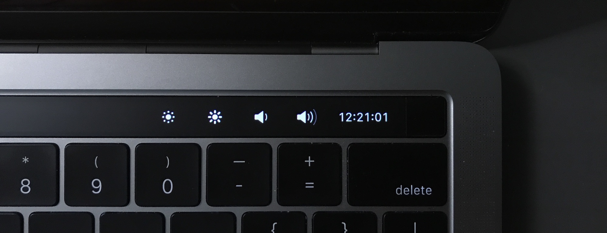
Brightness
Changing the screen brightness is a standard system-level control. To maximize usefulness, the buttons reproduce the native handling of modifier keys and incorporate additional functionality through long press gestures.
Single Press: Turns screen brightness up / down.
Long Press Brightness Down: Locks the screen.
Shift Press: Turns keyboard illumination up / down.
Option Press: Opens the Displays preference pane in System Preferences.
Option + Shift Press: Uses small steps to turn screen brightness up / down.
Implementation: In its default configuration, BTT cannot handle such a complex gesture set. (To be precise, there’s no way to not perform a default button action but also handle modifier keys.) Instead, I wrote a very small (~100 LOC) command line utility that handles modifier key logic and synthesizes the corresponding NSEvent objects.
Here be Dragons: Events created with type NSEventTypeSystemDefined and posted using CGEventPost(kCGHIDEventTap, ...) must have a magic delay after both the key down and key up events. Not doing so often results in a race condition between the two events.
Volume
The volume control works similarly to brightness, but also changes appearance based on current volume and mute status. Increasing the volume activates more “sound waves” in the icon:
Unlike the system control, the muted appearance preserves the last icon state; this is particularly useful in indicating if the volume will be loud or soft when unmuting.
Single Press: Turns volume up / down.
Long Press Volume Down: Toggles mute / unmute.
Shift Press: Plays the system feedback sound effect.
Option Press: Opens the Volume preference pane in System Preferences.
Option + Shift Press: Uses small steps to turn volume up / down.
Implementation: The volume control doesn’t just synthesize events, but also updates the icon appearance in real time. It uses the same command line utility as brightness for key presses but also a custom push-based service similar to calendar for volume change events.
Here be Dragons: To make the control feel responsive, it’s necessary to keep the latency low between a volume change event and the Touch Bar icon updating. I found that sending HTTPS requests to BTT incurred a non-negligible latency overhead compared to HTTP.
Clock App
Hiding the system menu bar frees up valuable vertical screen space, but also hides the time. Moving the clock to the Touch Bar fixes the issue and provides a convenient way to access additional features.
World Clock
I often want to know what time it is in Stockholm or New York City. By tapping the clock, I can immediately see the day of the week, date, and times for points of interest around the world. Tapping the local time again dismisses the modal.
Countdown Timer
Timers can provide utility in many contexts, ranging from Pomodoro timers to simple mental reminders. Unfortunately, macOS doesn’t come with a built-in timer application, and certainly not one for the Touch Bar.
Long pressing the clock reveals a minimal set of options to start a timer or cancel the existing one.
Implementation: I built the timer with simple source-embedded shell scripts to avoid the need to compile yet another custom command line utility.
Secondary Widgets
Workflow macros can offer power users a great deal of utility with very little work or setup. I’ve created a handful of destructive / not undoable macros (in red) as well as a few general-purpose ones (in gray). These macros only show while I hold down the three bottom-row modifier keys (command + option + control).
Each macro simply opens a Terminal window with the pre-defined commands. Macros execute in a Terminal window rather than in the background because visual execution of commands allows error states or those that require user interaction (such as entering an RSA key passphrase) to work seamlessly.
Using the Preset
Caveats
I designed this preset for my own use-cases and workflow. Power users who have non-development workflows, don’t use trackpad gestures for Exposé, or keep the MacBook Pro in clamshell mode / on a stand may not find much utility in this preset. If you find this to be the case, consider perusing other presets created by the BetterTouchTool community.
Installation
- If not already installed, download and install BetterTouchTool.
- UPDATE (Aug 28): The preset was exported and tested using BTT v2.536 and may not work for the recently released BTT v2.6xx. You can download
btt2.536.ziphere: https://bettertouchtool.net/releases/
- UPDATE (Aug 28): The preset was exported and tested using BTT v2.536 and may not work for the recently released BTT v2.6xx. You can download
- Download the latest controller scripts and compiled service binaries for the preset: andrewchidden/btt-controllers.
git clonethe repository to have the path~/bettertouchtool.- Alternatively, download the zip archive, decompress, and move + rename as
~/bettertouchtool.
- Decide on a preset flavor:
- andrewchidden-with-settings.bttpreset if new to BetterTouchTool. Contains everything including BetterTouchTool settings to allow the preset to function as intended.
- andrewchidden.bttpreset if already using BetterTouchTool. Only contains controls and triggers. You will need to manually configure parts of the preset and/or BTT after installation.
- Download from a mirror:
- BetterTouchTool (share.folivora.ai)
- andrewchidden-with-settings.bttpreset Direct Import or Source Viewer
- andrewchidden.bttpreset Direct Import or Source Viewer
- andrewchidden/btt-presets (github.com)
- BetterTouchTool (share.folivora.ai)
- Configure the preset—please look at the next section for instructions. This is required for the preset to work!
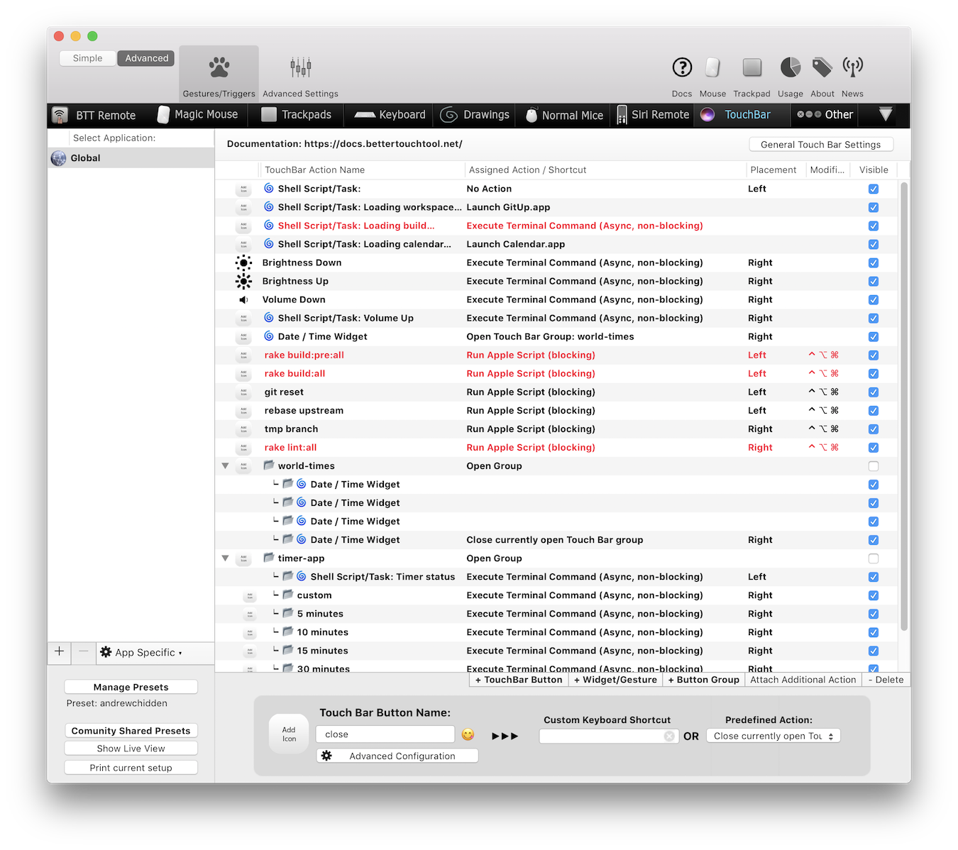
What BetterTouchTool should look like after importing the preset, minus the red entries which are private widgets:
Configuration
For complete environment variable documentation, please see the README at andrewchidden/btt-presets.
Note: To set some environment variable <env_var> to value <value>, modify (or create) the file ~/.bash_profile to include the line export <env_var>=<value>.
- Identify where you downloaded the controller scripts. Ideally they already have the path
~/bettertouchtool.- If this is not the case, set the environment variable
BTT_USR_ROOTto the controllers directory.
- If this is not the case, set the environment variable
- Set the environment variables
BTT_WEBSERVER_URLandBTT_WEBSERVER_SHAREDSECRETcorresponding to the BetterTouchTool web server URL and shared secret. Can be found by enabling “Advanced” mode, opening “Advanced Settings,” and then navigating to the “Webserver” tab.- The URL should be in the format
protocol://address:portand will default tohttp://127.0.0.1:64875if not specified.
- The URL should be in the format
- Set the environment variable
BTT_EVENTKIT_CALENDAR_NAMESto a comma-delimited, case-sensitive list of calendar names that should be checked for upcoming events. - Set the environment variable
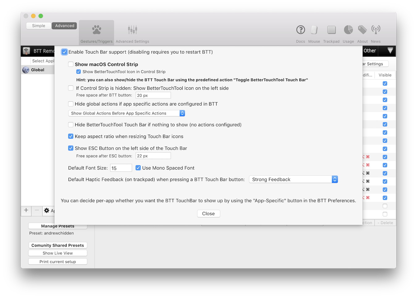
BTT_GIT_WORKING_DIRto the primary working directory for Git diff statistics and macro-triggered Git operations. - If necessary, modify the “General Touch Bar Settings” to match those below:
Source
The project is separated into three repositories:
- btt-presets contains the preset JSON configurations.
- btt-controllers contains the required controllers and pre-built services for the preset.
- btt-services contains the source of services used by the controllers.
The setup loosely follows the model-view-controller pattern, with the services as the model and presets as the view.
Both services and controllers employ good test coverage with OCMockito used to perform unit tests on services and Bats used to perform unit and integration tests on controllers.
Contributions are welcomed :)
Optimizing the HIG for Power Users
Regions
Apple defines three regions in the HIG for the Touch Bar: the system button, app region, and Control Strip:
I instead follow these guidelines to better suit my own workflow:
The system button should always show the Escape button. Apple’s guidelines say to alter the button based on context, such as showing Cancel or Done, but a static Escape key seems much more suitable for power users given its frequency of usage.
The app region should show current workflow state as text. Controls in the app region offer utility regardless of context, and thus should not change when switching between applications.
The Control Strip should show a static set of system-level controls such as buttons to adjust the volume or screen brightness.
Visual Design
Clearly the design of my preset is not flashy or colorful. However, since the MacBook Pro keyboard doesn’t come with a multi-colored LED backlight, it seems logical that the Touch Bar should follow suit. Even Apple’s guidelines suggest that developers “make the Touch Bar similar in appearance to the physical keyboard” by using monochromatic colors.
The spartan design doesn’t just match the surrounding hardware better, but creates fewer distractions while working. And because the layout doesn’t change when switching between applications, it’s also possible to press the correct control without looking.
Buttons
Although the visual design roughly follows Apple’s HIG, the largest difference comes from the treatment of buttons. From a personal standpoint, the gray bezel simply looks out of place when applied to all button types. Apple comments that “the system-provided bezel is designed to have an appearance similar to physical keyboard buttons.” But the keys on space gray MacBook Pro models are black, not gray.
While it’s not possible to match the appearance of physical keys on the Touch Bar, one alternative is to simply reduce the number of buttons with gray backgrounds. I designed my setup around the following button types:
Icon-only button: No background. The icon already indicates the control’s interactivity.
Tappable text label: No background. The label’s primary function is to display a textual status, not act as an interactive control.
Normal text button: Gray background. The button’s primary function is to respond to taps and perform an action.
Destructive text button: Red background. Similar to a normal text button, but performs a destructive and potentially undoable action.
Anatomy of a Useful Control
The set of controls to show is a deeply personal choice that depends on workflow and preference. These are the guidelines I followed when creating my Touch Bar controls:
Avoid controls whose primary action is to launch an application. I found that the Touch Bar could not adequately replace the Dock or Spotlight. Instead of application icons, I use tappable text labels that can show workflow status in addition to opening the relevant application.
Offer functionality beyond what a single keyboard shortcut can accomplish. To maximize utility I only assign actions to buttons that trigger non-trivial workflow macros, such as pulling and then rebasing.
Discard any controls not workflow related. Although at one point I considered widgets to show the weather and AAPL stock price, neither directly affect my development workflow.
Handle modifier keys and long presses for surfacing complementary actions. As a power user, I’m used to taking advantage of macOS features hidden behind modifier keys. I wanted to extend similar functionality to the Touch Bar such as by locking the screen or muting the volume when long pressing.
Use buttons or swipe gestures instead of sliders. Sliders take up valuable space where other controls could fit into. Discrete buttons and horizontal swipe gestures can work similarly well, but without the spacial overhead.
BetterTouchTool Development Tips
The complexity of BetterTouchTool can make it a difficult platform to work with. I’ve compiled some tips and best practices for those thinking of developing with BTT.
Use Pixel-Aligned Icons
To achieve best results, only include pixel-aligned icons with a scale factor of @2x. Apple’s set of system-provided icons usually work well as a starting point.
In some cases, you may need to create custom icons or pixel-align existing ones. For example, the brightness up and down icons in my setup are improved pixel-aligned re-creations of the system ones. See also Apple’s guidelines on custom icons.
BTT will not automatically render icons at the @2x scale factor, so you must specify the icon width and height in the item customization options. Note that BTT accepts icons dimensions in points rather than in pixels, contrary to what’s shown next to the text box.
Optimize Included Assets
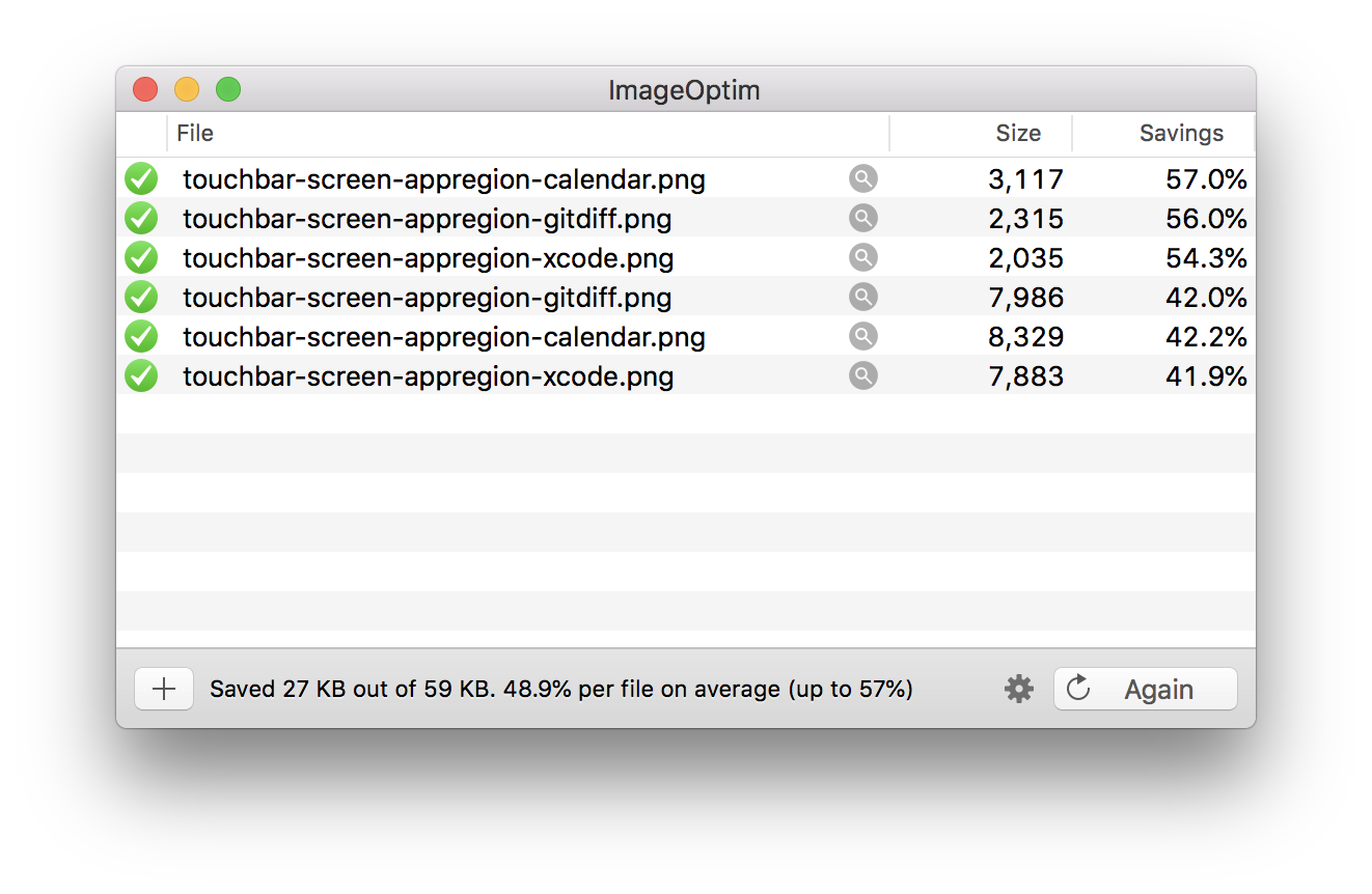
On the topic of icons, consider performing lossless compression on icons and other image assets. Doing so makes the exported JSON much smaller (obviously) but also more readable when shared. Smaller icons also result in better rendering performance, although most gains will come from providing correctly-scaled, pixel-aligned icons.
Free tools such as ImageOptim are straightforward to use and often reduce icon sizes by over 50%.
Add Test Automation for Custom Controls
A wise man once said “you can never have too many tests.” While clearly this isn’t true and perhaps the man wasn’t so wise, we do want some way other than the Touch Bar breaking during the day to verify that things work as expected.
Prefer Push to Fetch
It’s often very inefficient to poll a scripting API just to monitor for state changes. Consider using or creating a push-based service similar to those used in the calendar and volume widgets described above.
Minimize AppleScript Usage
AppleScript is not known for its performance. BTT officially gained support for direct shell script invocation in version 2.331 (released Jan 20, 2018). If the widget doesn’t require interacting with special scripting APIs, consider writing a shell script or even a standalone command-line utility instead.
In addition, shell scripts can be an order of magnitude faster. Since scripts may run often if used for polling an API, using AppleScript incurs a non-negligible energy and performance overhead. From the BTT developer:
“Run Shell Script and Show Return Value” In many scenarios this will be much more performant than the Apple Script widget as it can run multiple scripts/tasks/commnands[sic] in parallel. It can be combined with the new predefined action “Execute Shell Script / Task”.
Monitor Energy Impact
You can use Activity Monitor check the energy impact of both BetterTouchTool and its children. While it doesn’t show more detailed instrumentation or individual script performance, it does provide a good benchmark.
See also Nicholas Nethercote’s post on what exactly is behind the “energy impact” value in Activity Monitor.
Aim for Feature-Parity with Native Controls
If replacing items in the Control Strip, handling modifier keys and key repeating can make presets feel less divorced from the native system controls. Power users especially may expect certain key combinations to work in particular ways, such as shift + volume playing a feedback sound.
Join the BetterTouchTool Community
There’s a relatively small bunch of BetterTouchTool users and developers on the official BTT forum. It can provide a source of inspiration for new widgets or even basic code samples. And if all else fails, ask Andreas Hegenberg (the developer of BTT) for support. He’s quite responsive to questions on the forum.
Conclusion
With any luck you’re a little more convinced that the Touch Bar actually can be useful for power users. It just takes a few software modifications and a little creativity. ♦
Comments and discussions:


